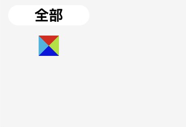
写前端页面时经常会遇到有点三角形的小图标需求,大概如下图所示

这种情况使用图片显示不合适,适合使用 css 的伪类结合 border 属性来实现,如下代码
<!DOCTYPE html>
<html lang="en">
  <head>
    <meta charset="UTF-8" />
    <meta name="viewport" content="width=device-width, initial-scale=1.0" />
    <title>css mini triangle arrow</title>
    <style>
      html,body{
        background-color: #f5f5f5;
      }
      .box {
        width: 80px;
        height: 20px;
        border-radius: 10px;
        background-color: #f5f5f5;
        position: relative;
        text-align: center;
        line-height: 20px;
        font-size: 14px;
      }

      .box.active {
        background-color: #ffffff;
        font-weight: bold;
      }

      .box.active::after {
        content: '';
        position: absolute;
        bottom: -30px;  /* 调整位置 */
        left: 50%;
        transform: translateX(-50%);
        border-width: 10px 10px 10px 10px;
        border-style: solid;
        /*上右下左*/
        border-color: #e20808 #a8e208 #0816e2 #08b6e2;
        /*border-color: #e20808;*/
      }

    </style>
  </head>
  <body>
    <div class="box active">全部</div>

  </body>
</html>
我这里将 border 渲染的部分单独拿出来研究,如下图,可见border 是由四个不同方向的小三角组成,想要哪一个只需要把其它几个的border-color 设置成 transparent 透明即可。border-width 也可以在四个方向上设置为0,这样的话等于宽度直接减少一半。
本文由 dealdot <dealdot#163.com> 创作, Full Stack Developer @ DeepBlue
本文最后编辑时间为: May 21, 2024 at 17:44 pm
转载请注明来源